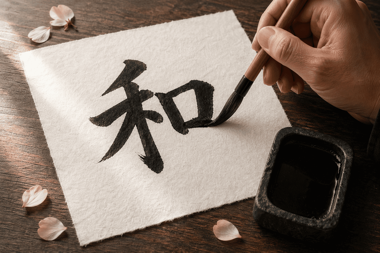
Kanji calligraphy starts with a choice, and most beginners make it without knowing. They pick a character because it looks impressive, then spend a week fighting twelve strokes they cannot yet control. A better start is one character on one sheet, chosen for its balance and for what it means to you. The brush rewards that kind of patience, and it shows every hurry.
This guide helps you choose. You will see why some characters reward the brush more than others, how stroke count changes a character, and where the ink should sit on the sheet. It then covers a character for the wall, tracing the order first, and a few objects for showing a finished piece. It closes with a hand-shaped sweet and a plan for your first ten characters.
Choose characters with clear balance and a meaning you like. Begin with very few strokes, such as 一, 山 and 川, so you can judge every stroke. Then move to richer characters such as 花, 風 and 道, which you may want on the wall. Stroke count matters less than whether you can picture the finished shape.
What Makes Kanji Calligraphy Different From Writing Kanji
Writing kanji with a pen is about getting the shape right. Kanji calligraphy is about how the shape feels. The same character can be correct in a notebook and still look cramped on a brushed sheet. That gap is the whole subject of this guide, and it is why the choice of character matters so much more here than it does in a study routine.
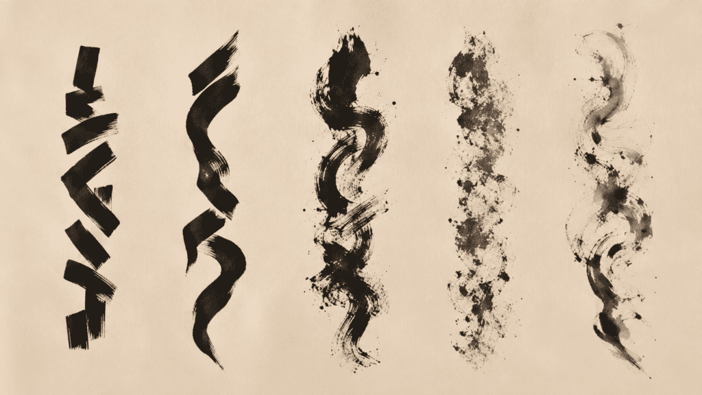
With a pen, every stroke has the same weight. With a brush, a stroke starts light, presses down, slows and lifts. A single horizontal line can show three different movements. This is why teachers often hand a beginner one plain character for a whole lesson. The character is not the lesson. The movement of the brush is, and a simple character lets you see it clearly.
Choosing a Character: Balance, Meaning, Stroke Count
Three questions help you choose. First, does the character have a clear balance, with a visible centre and parts that answer each other? Second, does its meaning matter to you, so that you will want to keep practising it? Third, can you handle its stroke count today? A character that passes all three is a good place to begin, and one that fails two is better left for later.
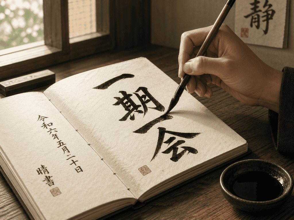
Balance is easy to test with your eyes. Look at the printed character and ask where its weight sits. A character that leans left or right needs a firm hand to stand upright on the sheet. A character with a strong vertical axis stands more easily. Meaning is personal, and no list can pick it for you. If a character makes you pause, it is a good candidate, because you will return to it.
Stroke count is the practical test. Fewer strokes mean fewer places to lose your rhythm. A character with twelve strokes asks for twelve decisions about pressure, speed and space. That is a fine goal for week four, but it is a hard start. If you are unsure, begin lower than you think. Skill grows faster on a simple character you can finish than on a rich character you abandon halfway.
You may also like
Few Strokes, Nowhere to Hide: 一, 山, 川
The character 一 means one, and it has a single stroke. It is a horizontal line, written left to right. Nothing could be simpler, and nothing is more exposed. The brush touches down, presses, glides and lifts, and every part of that movement is visible in the finished line. A wobble in the middle looks like a wobble. A rushed ending looks like a rushed ending.
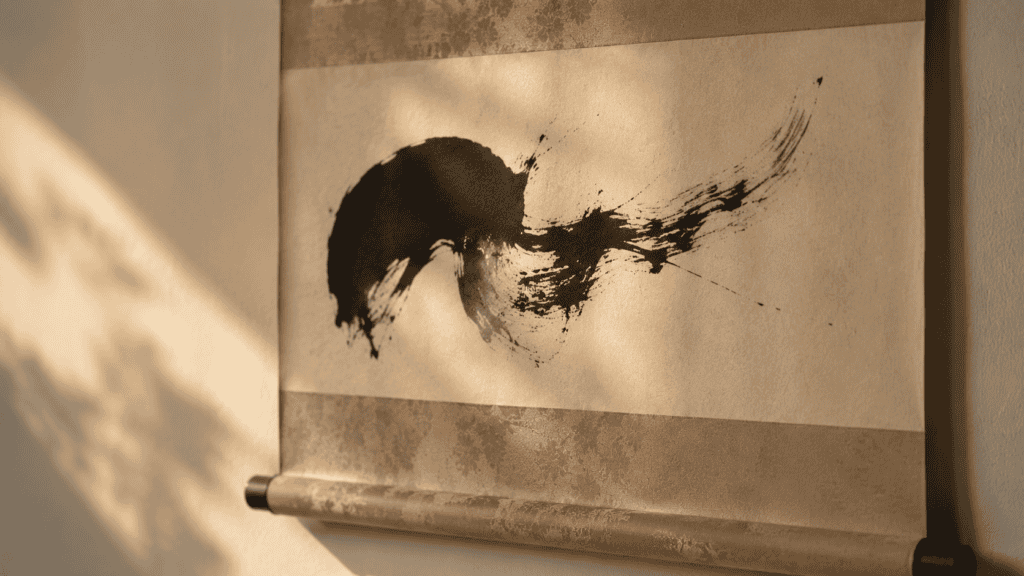
That honesty is why many teachers begin here. You can fill a sheet with 一 and learn more about the brush than a sheet of complex characters would teach. Watch how the line starts, how it travels and how it finishes. Then try again, because the sheet records what your hand actually did.
The character 山 means mountain and has three strokes. Two short verticals stand beside a taller one in the middle, tied together by a base. It teaches spacing, because the three uprights must feel evenly placed. The character 川 means river, also in three strokes. Its three lines are vertical and nearly parallel, yet they should not match exactly. A little variation in length gives the feeling of moving water.
Together, these three characters form a gentle first week. The first teaches you to draw a line, and the second to place strokes in a row. The third shows how to vary them without losing order. None needs more than a few minutes a day. By Friday, you will see the differences between your own lines, which is the first real skill in kanji calligraphy practice.
Characters From Nature: 雨, 花, 風
Once the simple lines feel steady, nature offers some of the most satisfying characters to brush. The character 雨 means rain and takes eight strokes. A frame sits at the top, and small drops fall inside it. The drops are the charm of this character. Each one is a tiny touch of the brush, and the rhythm of those touches is what makes the character look like weather.

The character 花 means flower and takes seven strokes. A grass element sits above, and a changing element sits below. Its first word in the MJ workbook files is hanami, cherry-blossom viewing, which is a good reminder of why people love to brush it. The upper and lower halves must feel connected, even though they are written separately. If the two halves drift apart, the flower loses its stem.
The character 風 means wind and takes nine strokes. It has a wide outer shape that opens at the bottom, with a small shape inside. The challenge is to keep the outer curve generous while the inside stays light. A heavy centre makes the wind feel trapped. A light centre lets the character breathe, which suits a word about moving air. It is a good character for the second or third week.
Weight and Space on the Sheet: Where the Ink Sits
A character is only half of a brushed piece. The other half is the empty paper around it. Japanese calligraphers care about this space as much as they care about the ink. The empty area gives the character room, and it decides whether the piece feels calm or crowded. Beginners tend to write too small and too near the middle, which leaves the sheet feeling timid.
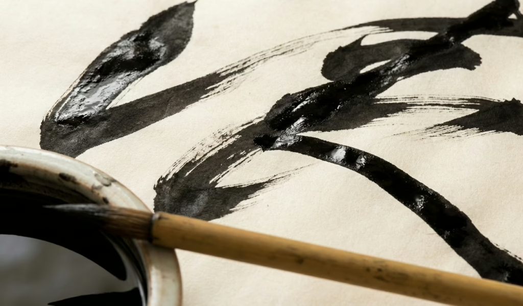
A simple habit helps. Before you load the brush, fold the sheet in half both ways to find the centre. Then picture the character filling about two thirds of the sheet. Leave more room at the bottom than at the top, because the eye reads a low margin as stable. If you want a deeper look at the idea, our piece on negative space in Japanese art explains why emptiness is part of the design.
Weight is the second half of the question. A thick stroke on the left asks for a counterweight on the right. This is not a rule you memorise. It is a feeling you build by looking at your own sheets.
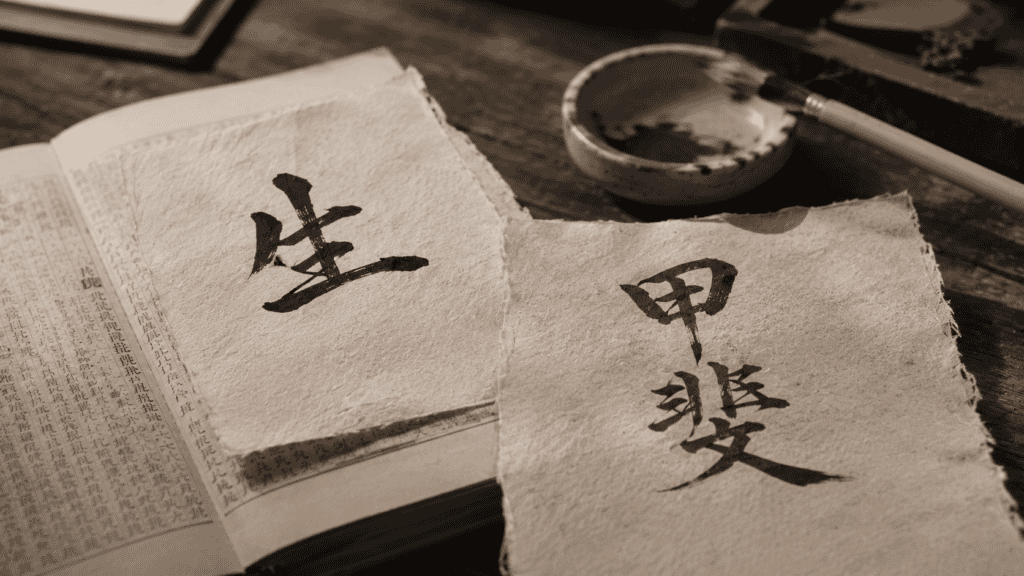
Here is where kanji calligraphy becomes personal. Put your best sheet and your worst sheet side by side, and ask what the difference is. Often it is not skill. It is attention, or the day, or how much space you left. The worst sheet is not a failure. It is the clearest record of what you have yet to learn.
A Character for the Wall: 心 and 道
At some point, you will want a character that lives on a wall. Two stand out for the way they carry meaning. The character 心 means heart or mind and has four strokes. It looks simple, yet it is a test of timing. Three small dots and one sweeping curve must feel related, like a short phrase of music with a long final note.
The curve in 心 is the hard part. It begins low, sweeps to the right and lifts upward at the end. A shaky curve shows at once. A confident one gives the whole character a sense of calm. Practise the curve alone on scrap paper for a few minutes, then add the dots. Most learners find the dots are easy once the curve is steady. That is a common order of difficulty.
Meaning matters on the wall, because you will see the character every day. A word like heart asks you to look inward, and a word like path asks you to look ahead. Choose the one you want to be reminded of. Some people pick a character for the new year, and others pick one for a room.

道 and 書道: The Way of Writing in One Character
The character 道 means path or way, and it takes twelve strokes. It is the richest character in this guide, so it belongs near the end of your first month. Its first word in the MJ files is 書道, shodo, the way of writing. That is the name Japanese calligraphy gives itself. In other words, the art of brushing characters is called a path, and the path is made of this very character.
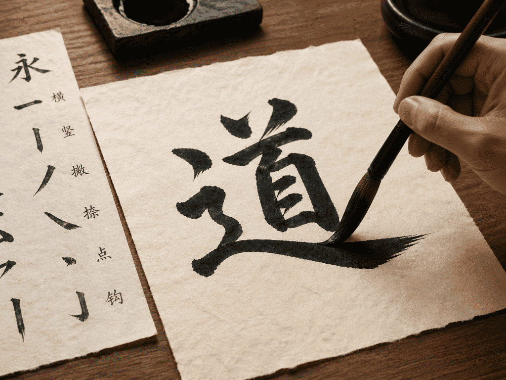
Brushing 道 teaches almost everything at once. A left-hand element sweeps along the bottom like a road, and a right-hand element sits above it. The road stroke must be long and generous, so the character does not feel squeezed. It is the longest stroke you have met so far, and a fair test of speed over distance.
The Metropolitan Museum of Art holds a hanging scroll made in Japan around 1663 to 1664, titled The Gateway Character “Lotus”. It is ink on paper, and it is built around one oversize character. The museum page is a useful reminder that a single character can fill a whole scroll. If you want to read more on the art itself, our guide to shodo as a fine art goes deeper.
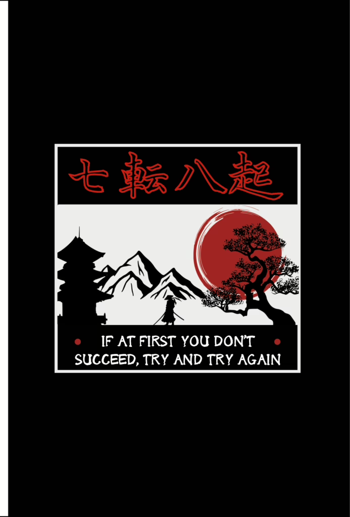
The proverb on that notebook fits this stage well. A character like 道 will not come right the first time, or the seventh. Each attempt teaches something small: a stroke too heavy, a turn too sharp, a margin too tight. Keep the failed sheets in a folder, and look back at them in a month.
Tracing the Order Before the Brush Touches Paper
Before you brush any character, learn the order of its strokes. Order decides how the ink flows, where the weight falls and how the strokes join. A character brushed in the wrong order often looks off, even to someone who cannot say why. The general pattern is simple: top to bottom, left to right, with the outer frame before the inside. Exceptions exist, so check each character as you go.
The best way to learn the order is to watch it, then trace it. The practice tool’s stroke-order canvas animates each stroke before you write it, so you can see the direction and the pace. It holds 100 characters, and you can trace each one on screen as many times as you like. That is a calm way to rehearse before you load a real brush.
Tracing on screen is not a replacement for ink. It is a rehearsal. You learn where each stroke begins, which way it travels and where it ends, and your hand carries that memory to the paper. Many learners find their first brushed sheet is much better after two or three on-screen runs. For a wider look at why order matters, see is stroke order important.
Stroke count shapes the look of a character, too, and our guide to kanji stroke count explains why. A character with few strokes reads as open and bold. A character with many reads as dense and intricate. Neither is better. They simply ask for different brushwork, which is why it helps to alternate between them as you practise.
Ten Proverbs to Carry With You
A printable folio of ten Japanese proverbs, each set in kanji with its reading and a line on where you will hear it.
Shaped by Hand: Ohagi
Between sheets, a hand-shaped sweet makes a good pause. Ohagi are rounds of partly pounded rice, covered in sweet red bean paste or dusted with toasted soybean flour. Each one is shaped by hand, and none is exactly like another. That makes them a fair match for a brushed character, which is also made by hand and never repeated. They are also the sweet of the autumn equinox, a seasonal note beside 花 and 風. The pause matters more than it seems. Ink needs time to dry, wrists need rest, and a plate of something sweet gives both a reason to wait.
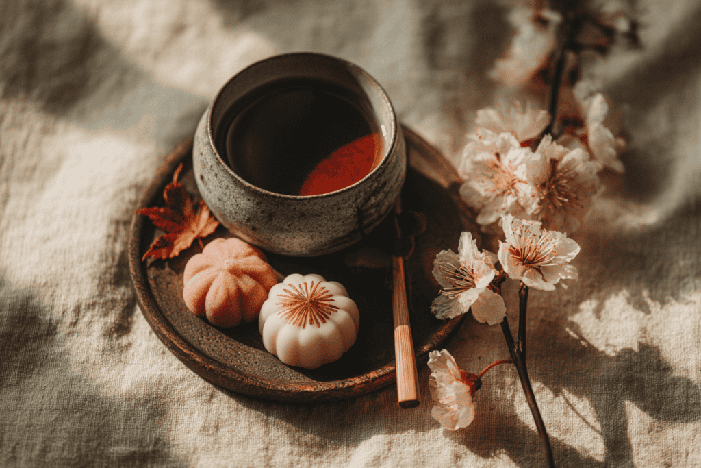
One Sweet, Two Names
The same sweet has a spring name. In spring it is called botamochi, after the peony, and in autumn it is called ohagi, after the bush clover. The sweet is the same, but the name follows the flower of the season. That small detail is typical of how Japanese food keeps time. It is a good thing to know when you meet one in a shop window and wonder which word to use. The change of name is a small calendar for the table, marking the turn of the seasons without a word.
Ohagi — pounded rice with sweet red bean
Cook half a cup of sweet rice and a quarter cup of short-grain rice with three quarters of a cup of water, then pound it while hot until most grains are crushed and some remain. Divide into eight oval portions with wet hands. Wrap each around a small ball of sweet red bean paste, or press each onto a flat round of the paste. Roll the filled ovals in toasted soybean flour mixed with sugar. Eat the same day.
Eat the ohagi the day you make it, with a cup of green tea. The rice is at its best within a few hours, and the paste tastes brighter when it is fresh. Then go back to the sheet with a clear head. When you return, look at your last sheet first. Ask which stroke you liked best, and which one you would change. Write the answer on a scrap of paper, and keep it beside the brush for the next session.
Objects for Displaying a Finished Character
A finished character deserves to be seen. The simplest way to show one is to put it on a board, set it on a stand, and place it where the light is soft. You do not need a gallery wall. A single character on a shelf is enough to change a room, and it reminds you to keep practising. These few objects make the display easy and keep it looking planned rather than improvised. Think of them as a frame for your effort. A board gives the character an edge, a stand gives it height, and a shelf gives it a place in daily life. Each choice is small, yet together they turn a practice sheet into something you are proud to leave in sight.
Nagatoya Shikishi Boards — a square board for one character
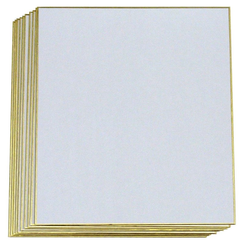
A shikishi is a square art board, made for a single poem or a single character. The Nagatoya Shikishi Gasen set comes with ten sheets, so you have room to fail nine times and keep the tenth. Its square shape suits a character like 心 or 道, because it frames the piece without crowding it. The board is stiff enough to stand on a shelf and light enough to hang. The ten sheets are enough for a full month of finished pieces. Brush on it only after you have practised on scrap paper, because the surface is made for finished work. Keep the spare boards flat and dry between sessions.
Display is half the pleasure of the art. A character you brushed with care looks different once it stands on a shelf at eye level. You see it as a viewer would, not as the maker. That shift shows you where the weight sits, where the margin is too tight and which stroke you would change next time. A small stand keeps the piece off the desk. Turn it a little each week, and the light will show you something new in the same strokes.
Borrow the Alcove
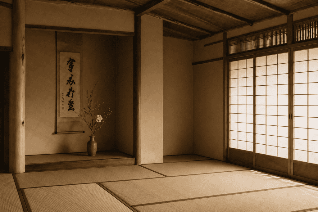
In a Japanese home, the tokonoma is an alcove made for a single scroll and a single arrangement. Its idea is to show one thing well rather than many things at once. You can borrow it. Pick a corner, clear it, and let one character fill it. Do not crowd the alcove with a vase and a candle. Let the character carry the corner alone, and let the eye rest on it for as long as it likes.
Blank Hanging Scrolls — a long format for one tall character
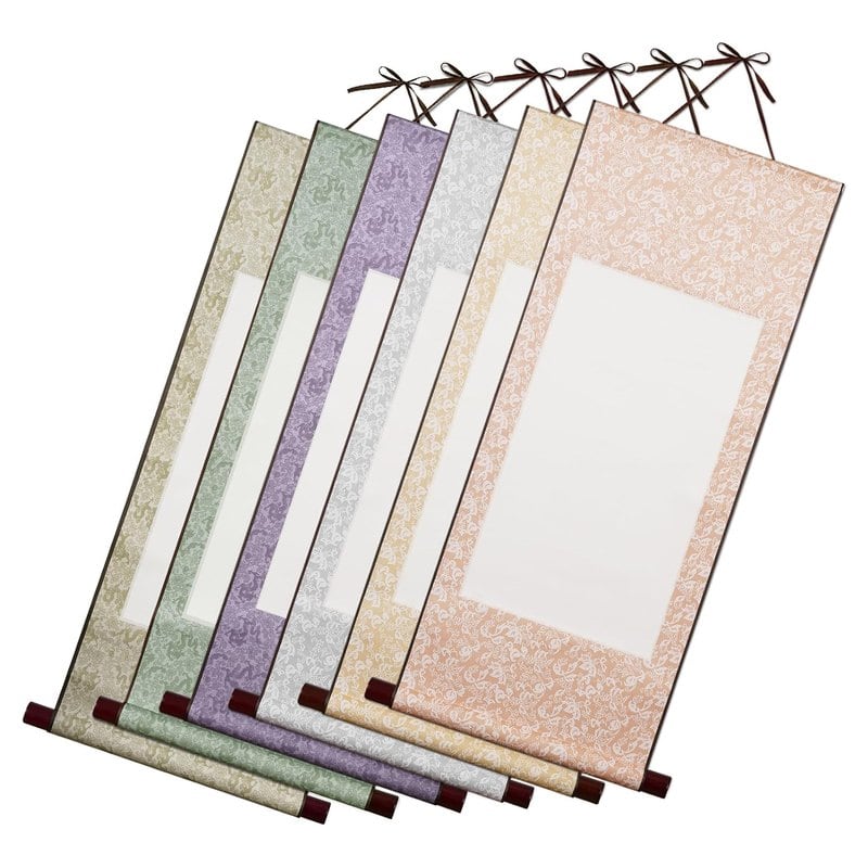
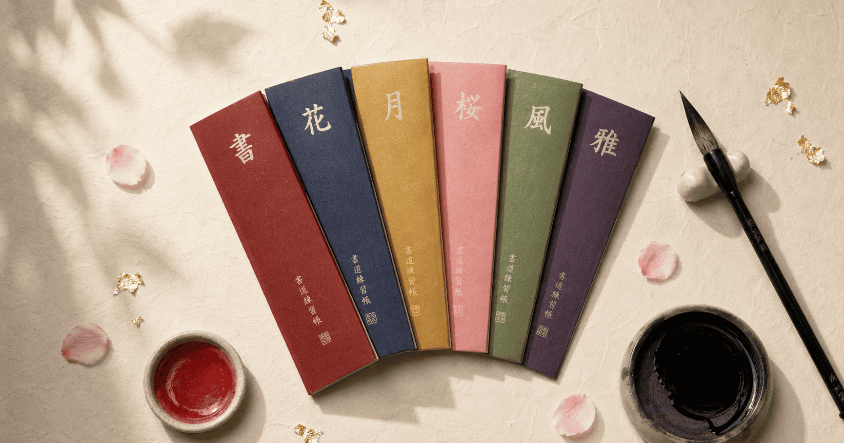
When you are ready for a larger piece, a hanging scroll gives a character real height. The Echaprey set of six blank mounted scrolls is sold for sumi and calligraphy, for hanging on a wall. The narrow, tall shape suits a stack of two or three characters, or one tall character such as 道. Start with a short practice run on scrap paper, then commit to the scroll once your hand feels steady. A scroll rewards patience and a good margin. Hang it where the light is soft, and let the tall shape show the character at full length. The six scrolls give you room to try a different layout each time, from a single big character to a short pair.
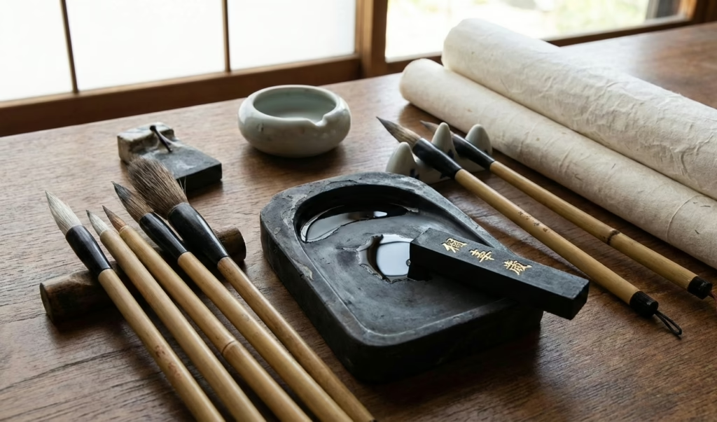
The last group is smaller, and each item is a tool for the brush itself. Ink, a seal pad and a brush are the three things a finished piece may need. A stick of sumi gives a deeper black than bottled ink. A red seal pad adds the small red mark that completes many Japanese pieces. With a wide brush, you can write a large character in a single, confident sweep, and the stroke keeps its energy from start to finish. Each one changes how a piece feels, though none is needed on day one. Add them as the sheets improve, and use each for the job it does best.
Three Pieces for the Final Touch
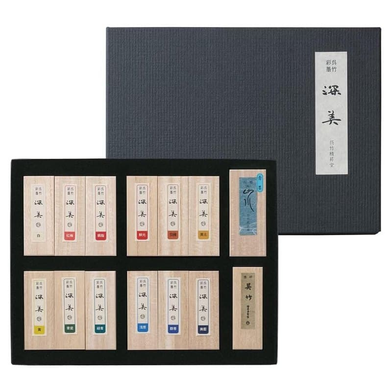
A set of Japanese sumi ink sticks for grinding a deep black.
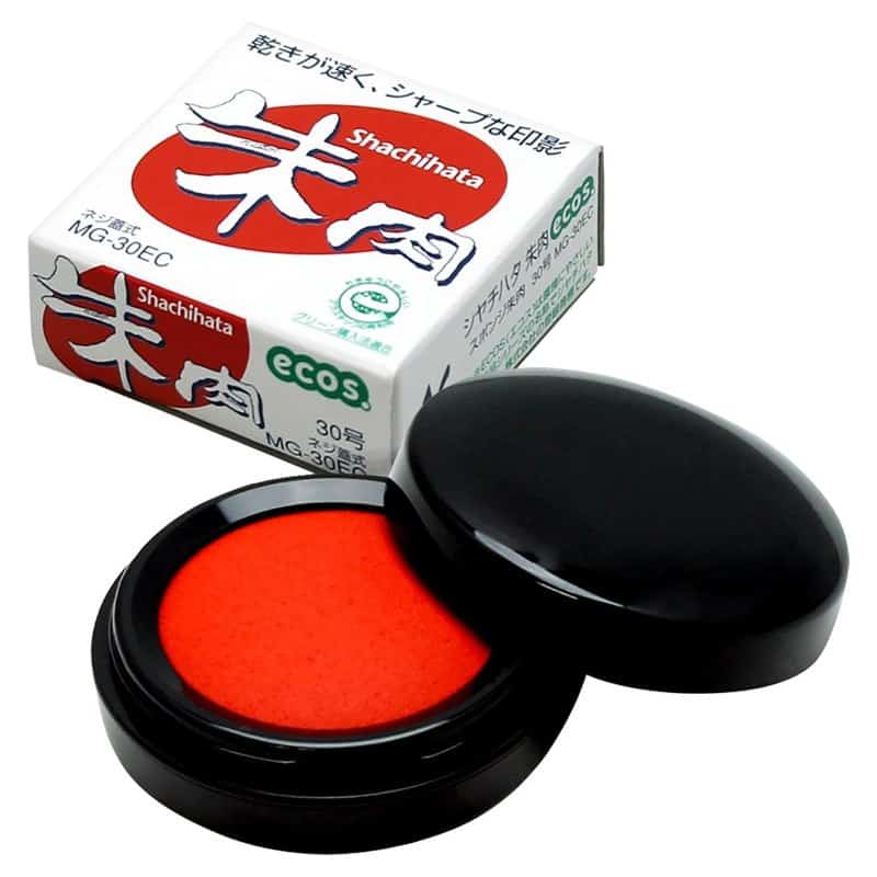
A vermilion pad for the small red mark that completes a finished character.
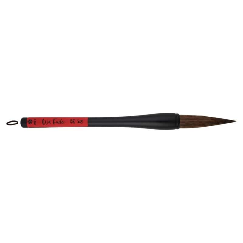
A 9.25-inch fude brush for large single characters and confident sweeps.
Keep the Set Small
Keep the set small and let your skill lead. A shikishi board, a stand and one good brush are plenty for the first season. A simple tabletop easel or a plate stand from any art shop will hold a board at a gentle angle. Add a scroll or a seal only when a piece asks for it. The aim is not a full studio. It is a small, steady setup that makes it easy to sit down, brush one character and leave it where you can see it tomorrow.
Your First Ten Characters
You now have enough to plan a first stretch. Start with the three simple lines, 一, 山 and 川. Move to the nature trio, 雨, 花 and 風. Then try 心 for the wall and 道 for the long road. That is eight characters, and it is plenty. Spend a week or two on each group, and keep every sheet. The aim is to see your own hand change.
Here is a gentle plan for each character. Trace the order on screen first. Brush it five times on scrap paper, then three times on a good sheet. Then choose the best of the three and put it somewhere you can see it. Do this for ten or fifteen minutes a day. If you want a character for a name, the Japanese name generator can suggest one, and you can choose a favourite from there.
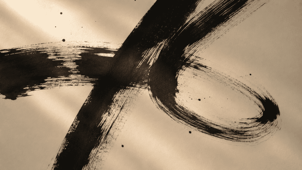
When the eight feel steady, you can pick two more of your own. Choose them for meaning, balance or simply because you like how they look. A good tenth character is one you would be happy to see every morning.
Recommended
Keep Your Expectations Plain
Keep your expectations plain. The brush is slow to teach, and it is honest. Some weeks will feel like progress, and some will feel like standing still. Over a season, you begin to see which characters suit your hand and which ones ask for a little more time. That slow change is the real reward of kanji calligraphy, and it comes to anyone who keeps showing up, one sheet at a time.
If you would like a guide beside you, the practice tool lets you watch each stroke animate before you brush it. Use it as a rehearsal before ink. The tenth attempt is usually better than the first, and it is yours alone.
A Brush, a Teacher and a Morning in Kyoto
Some of the best calligraphy moments happen in Japan itself. A teacher guides your wrist, and the ink is ground fresh. A morning like that changes how you hold a brush for years. It also gives the characters you practise at home a place and a voice, which makes them easier to remember when you are back at your desk.
We build days around moments like that: a private lesson with a calligraphy teacher, an hour in a stationery shop in Kyoto or a slow afternoon at a tea house. Every itinerary follows your pace and your interests, with the practical details handled for you. The characters you brushed at home become places, meals and conversations.
A Journey Planned Around the Brush
We can plan days around the details that matter to you: a private calligraphy lesson in Kyoto, a morning in a Tokyo stationery shop, a slow afternoon with tea and a sweet. Every itinerary is built around your pace and your interests.
Plan Your Custom Japan ItineraryQuestions Worth Asking
What kanji are good for calligraphy?
Characters with clear balance and a meaning you like. Start with very few strokes, such as 一, 山 and 川, so you can judge each line. Then move to richer characters such as 花, 風 and 道. Choose the ones you can picture finished and happily see on a wall.
Should I start with simple or complex kanji?
Start simple. A character with one to four strokes shows every movement of the brush, so you learn faster. Complex characters ask for many decisions at once, and a beginner often abandons them halfway. Add richer characters after a few weeks, once your lines stay steady from the first stroke to the last.
Does stroke count matter in calligraphy?
Yes, because it changes how a character looks and how hard it is. Few strokes read as open and bold, and nothing hides a wobble. Many strokes read as dense and intricate, and they ask for careful spacing. Balance matters just as much, so judge the shape as well as the number.
Can I hang my own kanji calligraphy at home?
Yes. Brush your best sheet, let the ink dry, then mount it on a square board or a hanging scroll. Place it at eye level where the light is soft, and leave empty space around it. One character on a shelf or in an alcove is enough to change a room.
What does 書道 mean?
It is read shodo and means the way of writing. It is the Japanese name for calligraphy as an art. The second character, 道, means path or way, so the name describes brushing characters as a path you walk over time, one sheet after another.