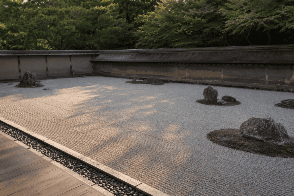
Negative space in Japanese art has a name of its own. The paper left alone is not the part the artist skipped. It is the part the artist composed. Painters call it yohaku, the remaining white, and they treat it as material rather than absence. Behind it sits ma (間), the wider idea that an interval carries meaning. Our essay on what ma means in Japanese life traces that idea in full. Here, we follow it through the arts: ink, prints, gardens, flowers, ceramics and buildings, and then into daily life.
Western composition tends to fill a frame, then balance what sits inside it. Japanese composition often works the other way. It places very little. Then it works the emptiness around that placement until the placement looks inevitable. Once you learn to see it, you find it everywhere in Japan.
What is negative space in Japanese art?
Negative space in Japanese art is called yohaku, the remaining white. Artists treat it as an active part of the composition, not as unpainted ground. The principle behind it is ma, the interval that gives shape to whatever sits on either side of it.
Yohaku, the Remaining White
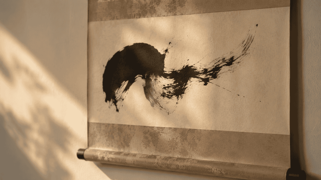
In sumi-e, or ink painting, the untouched paper does several jobs at once. It becomes mist, water, distance or air. Because nothing describes it, the viewer supplies it. That act of supply is the point of the technique, and it turns every viewer into a collaborator. A branch enters from one corner and stops. The rest of the sheet stays bare. Consequently, the eye reads scale, weather and season from an unmarked surface. Few strokes, in short, can suggest a whole valley.
The painter has set the terms, and the viewer completes the picture. This is why a good ink painting rewards a second and third look. Each time, the blank paper suggests something slightly different, depending on the light and your mood. The emptiness keeps working long after the brush has stopped.

The phrase for this is yohaku no bi, the beauty of the remaining white. Notice that the word names a beauty rather than a shortfall. In other words, the vocabulary settles the argument before it starts. The same discipline governs shodo, or Japanese calligraphy as a fine art. Readers judge a character partly by the paper around it. Therefore, a crowded sheet reads as anxious, however fine the strokes. A master leaves room, and that room is part of the reading.
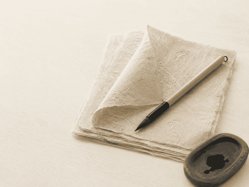
Paper matters here more than it does in Western practice. Washi, the handmade Japanese paper, carries ink differently across its surface. So the blank areas are never quite inert. They hold texture, and the texture reads as air. Hold a sheet to the window, and you can see the fibers.
How Washi Holds the White
Makers in Japan still produce washi by hand from long plant fibers, such as kozo, the paper mulberry. Those fibers lie in every direction, so the sheet stays strong and soft at once. Under raking light, the surface looks almost like cloth. When ink meets it, the edge of a stroke feathers slightly, and the untouched area around it keeps a living grain. That grain is why artists call the white “remaining” rather than empty.
A machine-made sheet behaves differently. Ink sits on top of it, and the blank areas look flat and printed. Once you compare the two side by side, the difference is hard to forget.
Negative Space in Japanese Art, Print by Print
The woodblock print made the idea popular, and then made it portable. Hiroshige built his views of Edo from broad, flat bands of sky and water. Often a single bridge or pine does the work of the whole scene. Everything else is color, graded softly and left alone. Everyone remembers Hokusai’s great wave for the wave. Yet look at where the eye lands once the drama has passed. It lands on the small mountain and the empty sky behind it.
The print is mostly open ground, and the wave only reads as enormous because of that. European painters who collected these prints noticed the emptiness first. As a result, they began cropping their own canvases and leaving passages bare. The flat open areas in a Whistler nocturne or a Degas pastel owe a debt here. So does the idea that a frame can cut a figure in half.
You may also like

The decorative screens went further still. Rinpa painters set irises or pines on sheets of gold leaf. The gold describes nothing, and nothing needs describing. Instead, the gold carries the space the subject needs, and it carries it at full visual richness. That is the point most readers miss. Negative space in Japanese art is not a budget decision. It is as deliberate on a gold screen as on an ink sketch, and often more expensive. Gold leaf was costly, and painters used it to frame emptiness rather than to fill it.
Prints, though, are where most people first meet the idea, because they were cheap, plentiful and widely copied. Ordinary people in Edo bought them as souvenirs and pinned them to walls. For anyone who wants to study the prints closely at home, one book stands out.
Hiroshige: One Hundred Famous Views of Edo — the series in one volume
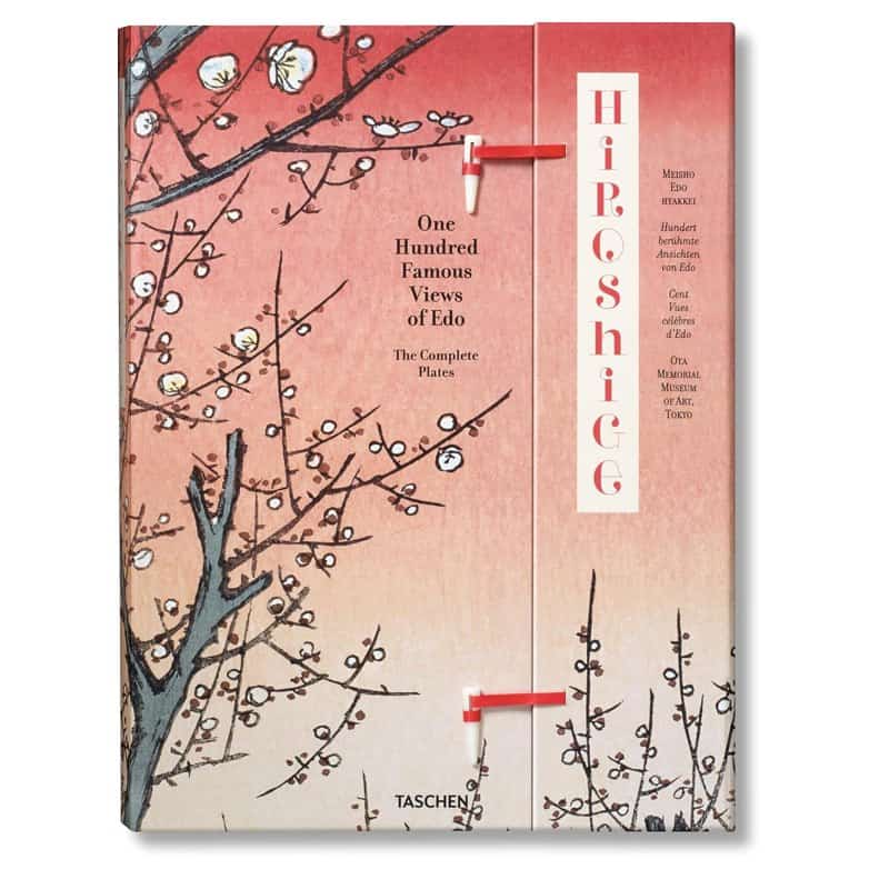
Hiroshige finished his last great series between 1856 and 1858, and it is a lesson in open sky. This TASCHEN edition of One Hundred Famous Views of Edo reproduces a complete original set held by the Ota Memorial Museum of Art in Tokyo. Each of the 120 images comes with a short description, so you learn the place as well as the picture. The book is also bound in the traditional Japanese fashion, which suits the subject. Turn the pages slowly and watch how often a scene rests on one bridge, one tree or one boat. After an evening with it, you start to notice how much of each view is simply color and air.
Prints and paintings ask you to look at yohaku from a distance. A garden, by contrast, asks you to sit beside it. The scale changes from a sheet of paper to a courtyard, and the material changes from ink to stone. Yet the method stays the same. A few elements are placed with care, and the space around them is worked until it holds the whole composition together. Kyoto has the best examples, and some of them are centuries old.
The most famous is a rectangle of white gravel behind an earthen wall. It has puzzled visitors for generations, and that puzzle is part of its design.
The Dry Garden
Karesansui gardens set a handful of stones in raked gravel. The gravel is not background. Instead, it is the majority of the composition. Moreover, the raking gives it rhythm and direction, like brushwork on a vast sheet. Gardeners rake the lines by hand with wooden tools, and they renew them often. Straight lines suggest calm water. Rings around a stone suggest ripples, so the gravel seems to move even though nothing in the garden does.
The effect depends on restraint. Add a few more stones, and the garden becomes a collection. Leave them sparse, and it becomes a landscape.
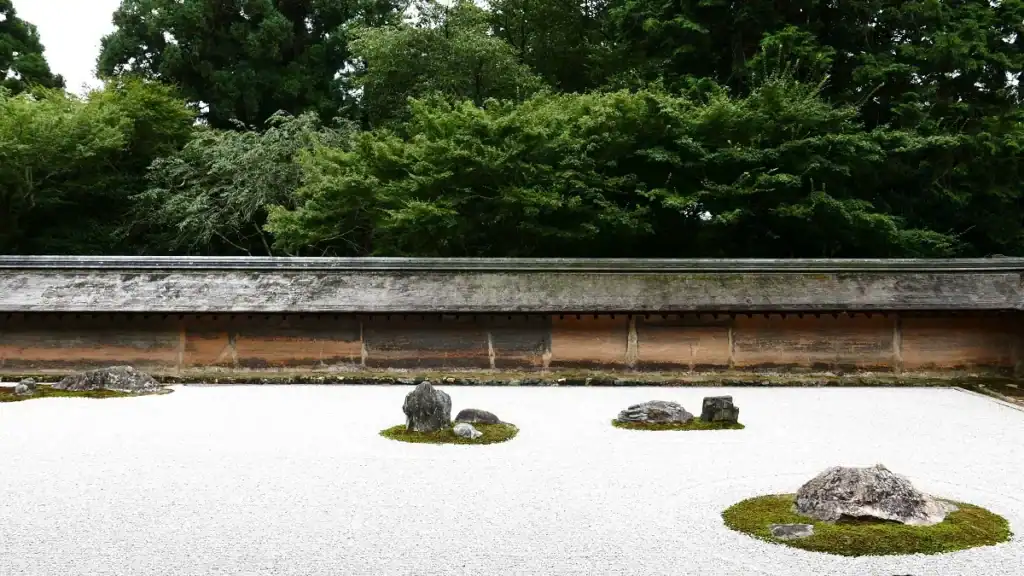
Ryoan-ji in Kyoto is the example everyone cites. Notably, no viewpoint shows every stone at once. The garden withholds completeness on purpose. Our itinerary for two well-paced days in Kyoto places it beside the other gardens worth the walk. The roji, the garden path leading to a tea house, works on the same logic in motion. It paces the approach deliberately. The spacing of the stones sets how quickly you may arrive. Wide gaps slow you down, while close stones let you walk briskly.
Step by step, the path empties your head before you reach the door. A guest who arrives this way enters the tea room already slowed down, which is exactly the intention. The garden has done its work before the first bowl of tea is poured.
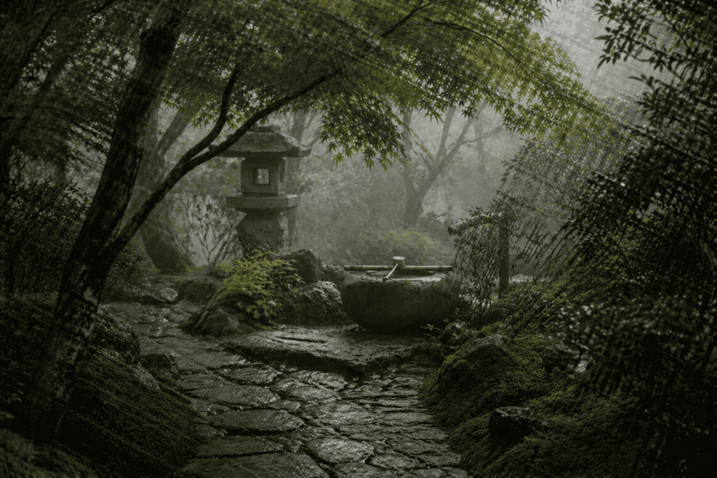
Water and Stepping Stones
Stroll gardens use water in the same way. A pond is a large open surface, and stepping stones cross it one interval at a time. Each stone is a pause. Meanwhile, the water between them holds reflections of the trees. So the empty surface is busy with light rather than objects, and it changes with every hour of the day. Morning mist softens the far bank. By afternoon, the surface turns bright and sharp, and at dusk it holds the last of the sky.
For visitors, the lesson is simple. Sit down before you judge a garden. Give it ten minutes, and the open ground starts to look full. That patience is the real entry ticket, and it costs nothing more than time. Early mornings help, since the crowds arrive later.
Ikebana and the Tea Room
Japanese flower arrangement composes with three points and a great deal of air. The stems are asymmetric. Moreover, the space between them is measured rather than incidental. Consequently, an arrangement reads clearly from across a room, where a dense bouquet would blur. A traditional room holds an alcove, a scroll and often nothing else. The tokonoma frames one object. Therefore, the surrounding emptiness reads as attention rather than shortage. The wall around the alcove is usually plain plaster, which keeps the eye on the single object.
Guests notice the single flower because nothing else competes with it. Hosts change it with the season, so the alcove becomes a small calendar. One branch in spring, one stem of grass in autumn, and the room shifts its mood. Guests read the season from it at once.
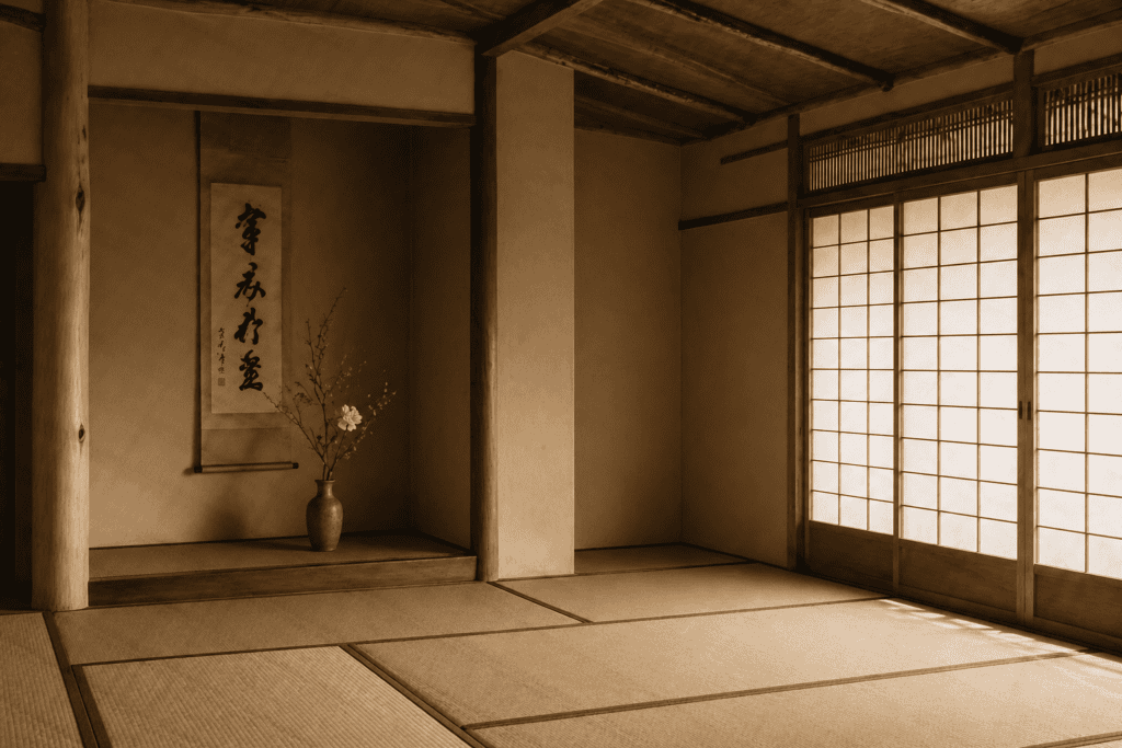
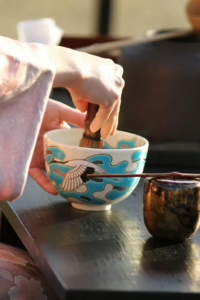
The same restraint governs the objects themselves. A tea bowl sits alone by design. So its silhouette has to survive without company. Makers know this, and they shape each piece to be seen on an empty mat. Timing is the temporal version of the same idea. In the tea ceremony, the host’s pauses are judged as closely as the movements. Our beginner’s guide to chanoyu walks through the sequence in full. Each pause gives guests time to notice the room, the bowl and the season.
Light, too, plays a part, and one short book explains it better than any other. A tea room is often dim, lit through paper screens, so the shapes inside it appear slowly. Your eyes adjust over several minutes, and details emerge from the shadows one by one.
In Praise of Shadows by Junichiro Tanizaki — the essay on dim rooms
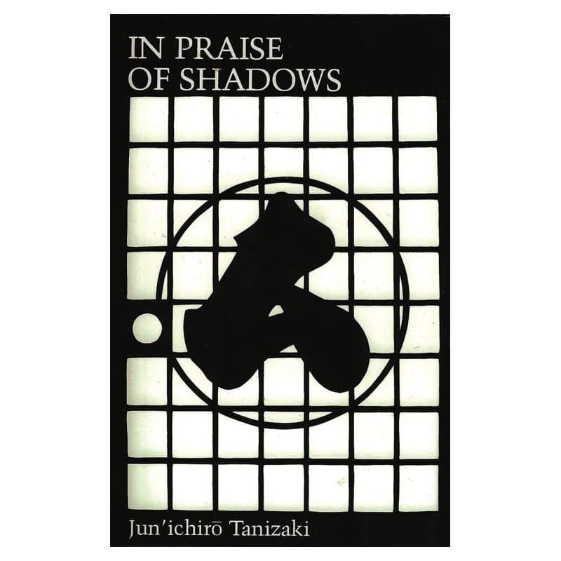
Tanizaki wrote this essay in 1933, and design students still pass it around. In Praise of Shadows argues that Japanese rooms were made for dimness, not glare. He writes about lacquerware glowing by candlelight, paper screens softening the day and the dark corner of an alcove. In each case, the unlit part of the room does the work. That makes the essay a perfect companion to the idea of negative space, only with light instead of paper.
This Leete’s Island edition runs just 56 pages, so it fits in a coat pocket. Read it on the train to Kyoto, then look again at the next tea room you enter. The shadows will look composed rather than accidental.
Tanizaki’s point reaches beyond rooms. He argued that Japanese taste prefers things that show their age and their making, rather than things polished to a uniform shine. A worn lacquer tray, a dull silver kettle and a bowl with an uneven glaze all fit that taste. In each case, the surface carries a history, and the eye has room to wander across it. That preference leads naturally to ceramics, where the empty passage is often bare clay. Potters prize that bare surface.
It also explains why a tea gathering feels unhurried. Every object has space around it, and every gesture has a pause after it. Nobody rushes, and nobody fills the silence with talk. The pace itself becomes part of the hospitality.
You may also like
Why Pottery Teaches It Best
Pottery may be the most intimate place to see yohaku, because you hold it in your hands. A painting stays on the wall and a garden stays behind its wall. A bowl, however, comes to you full of tea, and you turn it before you drink. Each turn shows another side, and each side shows a different choice about where the glaze stops. Connoisseurs spend years learning to read those choices, yet a beginner can feel them in a single afternoon.
The clearest lesson of all sits on the underside of the bowl, where most people never think to look.
Ceramics and the Unglazed Foot
Turn a good tea bowl over and you find bare clay. Potters leave the foot ring unglazed on purpose. Connoisseurs judge a bowl partly by that ring, because it shows the clay, the cut and the hand. The part the potter left alone is where the potter is most visible. The glaze itself often stops short. On a Hagi or Shino bowl, it pools, thins and then runs out, leaving raw body showing through.
Western ceramics tend to cover every surface. Here, by contrast, the uncovered passage is the passage people pay for.
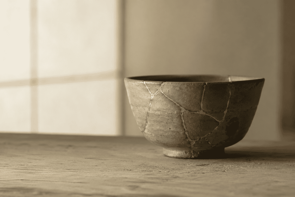
The same logic governs how people use the bowl. It sits alone on the tatami with nothing beside it. Consequently, its silhouette, its weight and its bare foot all have room to register. A crowded table would erase every one of those. Ceramics teach the idea in the hand rather than the eye. You feel where the glaze ends. Therefore, the lesson is harder to forget than any painting. Your fingers find the edge of the glaze before your eyes do.
Holding a bowl for a few minutes teaches more than a long lecture. Notice its weight, the warmth of the clay and the place where your thumb settles. Those details are where the maker speaks most clearly to the user.
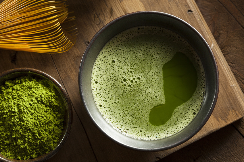
Matcha shows the bowl at its best. The bright green foam sits inside a darker rim, and the plain wood of the tray surrounds both. Nothing else is needed. A host might set a single sweet nearby, but never a crowd of plates. Even the whisk rests to one side, on its own small stand. The scene works because each object has its own patch of space, so the eye moves calmly from one to the next. Nothing touches anything else.
A Single Bowl at Home
That arrangement is easy to recreate at home. Choose one good bowl, clear the table and let the empty surface frame it. A small, well-made bowl is the simplest way to begin, and Japanese kilns still make them in many regional styles.
Kutani Rabbit Matcha Bowl — a small bowl from Ishikawa
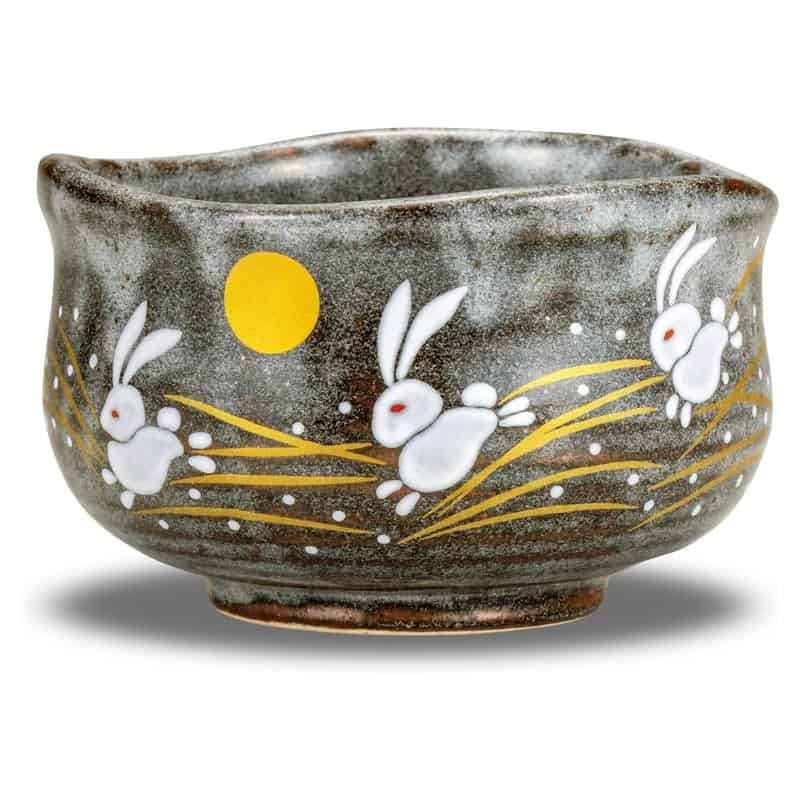
Kutani ware has been made in Ishikawa since the 1650s, and this Kutani rabbit matcha bowl carries that lineage into a modest, everyday form. It stands about 2.6 inches high and 4.3 inches across, so it sits comfortably in two hands. The gray ground is left largely plain, with the motif kept small. That restraint is exactly the point of this section. The rabbit is a popular motif in Japan, linked with the moon.
Set it alone on a bare table, whisk a bowl of matcha and notice how the empty surface frames it. Then turn it over and look at the foot. Even a simple bowl like this shows how a maker decides where decoration stops and clay begins. It also makes a thoughtful gift for a host.
Tea sweets follow the same rule, and they make a good first lesson at home. A wagashi is usually served one to a plate, with generous space around it. The plain block of red bean jelly below is a classic example. It comes from northern Osaka, where agar was made in the cold mountain villages of the late Edo period. Winter nights froze the gel outdoors, and the days thawed it again, until only light, dry strands remained. Traders shipped them across Japan.
Those strands set liquids into a firm, clean jelly. The method is simple, and most of the time is spent waiting for the mold to set. Koshian, the smooth bean paste, is sold ready-made in Japanese grocery stores, so the work takes only a few minutes.
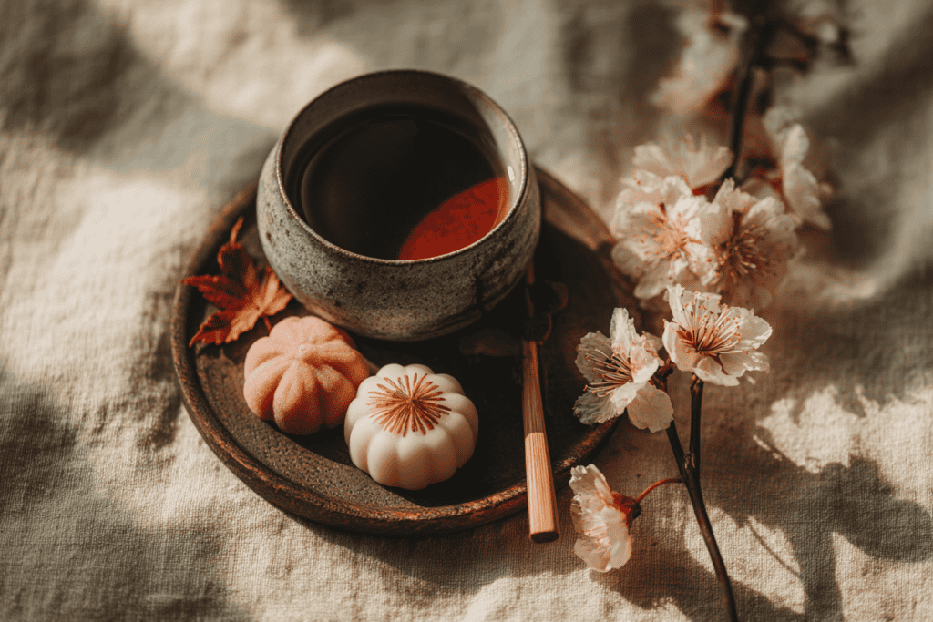
Decchi Yokan — a plain red bean jelly for tea
Rinse half an ounce of agar threads, squeeze them out and drop them into four cups of water. Bring the pot to a boil and keep heating until the agar has dissolved completely. Next, add about one pound two ounces of koshian and one and a quarter cups of sugar, mix well and bring it back to a boil. Take the pot off the heat and stir while it cools to roughly blood warmth, about 104°F. Pour the mixture into a mold and leave it to set, which takes around two hours. Finally, turn it out and cut it into neat rectangles. Serve one piece per small plate beside a bowl of matcha.
Serving It With Space
The recipe follows the Osaka version published by Japan’s agriculture ministry, which notes that it uses less sugar than smooth yokan. As a result, the taste is light and clean. Its plain surface also makes the point of this essay at the table. The sweet is simple, so the plate around it matters. Cut the slices cleanly with a wet knife, and keep them modest in size. A small, sharp rectangle on a wide plate looks deliberate. Keep the rest in the refrigerator.
A crowded plate, by contrast, looks like leftovers. The same sweet, served two ways, teaches the whole idea of yohaku in a single glance. Try it with any sweet, and the effect is the same. The plate does half of the presentation.
Ten Proverbs to Carry With You
A printable folio of ten Japanese proverbs, each set in kanji with its reading and a line on where you will hear it.
Rooms are where most people meet the idea without noticing it. A ryokan guest room looks almost bare on arrival, and yet guests rarely describe it as empty. The space feels generous instead. That feeling comes from centuries of measuring rooms by their intervals, as the next section explains. Futons come out at night and fold away in the morning, so the same floor serves for dining, sleeping and sitting. Nothing is fixed in place, and that flexibility depends on keeping the floor open.
Architecture and the Void
Traditional rooms are measured in ken, a unit describing an interval rather than a fixed length. A room is therefore defined by the spaces it contains. The sliding screen makes this literal. A wall can become an opening, then a wall again. Tatami mats add their own rhythm, since room sizes are counted in mats. A six-mat room and an eight-mat room feel different, yet both follow the same modular grid.
That grid lets a house expand and contract with the seasons. In summer, screens slide away and the garden becomes part of the room.
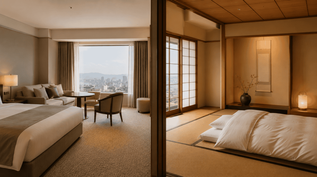
Modern Japanese architecture kept the habit rather than abandoning it. Tadao Ando’s buildings on Naoshima are largely an argument about void, light and approach. Much of the Chichu Art Museum sits below ground, so the emptiness has to be walked through. Our profile of Ando’s ten buildings on Naoshima follows that route. The courtyards there work like stone gardens made of concrete. A wall frames a rectangle of sky, and the open floor becomes the exhibit. The effect is calm, spacious and strangely moving.
Visitors slow down without being told. In short, the architecture does the same job as the tokonoma, only at the scale of a landscape. Walls hide the view until the right moment, then open it completely. That sequence of concealment and release is one of Ando’s signatures.
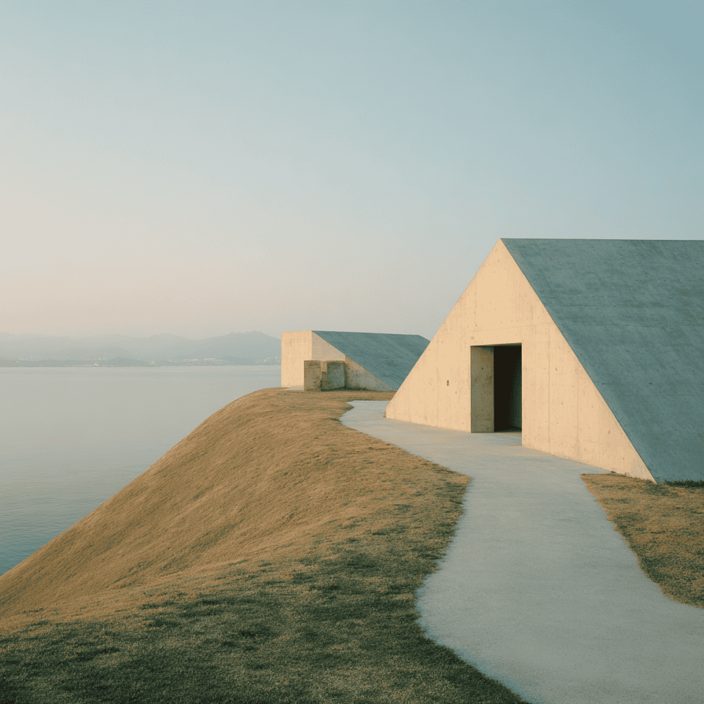
Visiting Naoshima
For the wider route through Japanese galleries and installations, our guide to art destinations in Japan maps where to go and in what order. Naoshima rewards an overnight stay, because the light on the concrete changes from morning to evening. Early visitors often have the courtyards nearly to themselves, which makes the empty spaces easier to feel. Several of the island’s galleries also limit visitor numbers, so the rooms rarely feel crowded. Booking ahead is wise in high season. Allow a full day.
Before you go, it helps to see these buildings through the eyes of the people who shot them. One recent book does that with unusual care, and its photographs were made over many years of visits. Its plates are large, crisp and carefully sequenced.
Tadao Ando: Light and Space — the Phaidon monograph
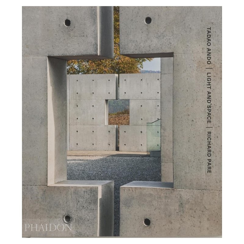
Published by Phaidon in 2025, Tadao Ando: Light and Space pairs Ando with the photographer Richard Pare across 28 projects. Most of the photographs had not been published before. The layouts are spare, with wide margins and full gatefolds, so the book practices the idea it records. Ando wrote the foreword himself and added four drawings printed on fine tissue paper.
An appendix on textured paper covers each project with plans and sections. It is a large, clothbound object, best kept on a low table where it can lie open. Above all, it shows how Ando builds with light and empty volume, which is negative space in Japanese art at the scale of a building. It also makes a handsome gift for anyone who loves architecture.
Ando’s work is often filed under minimalism, and the label seems to fit at first glance. The walls are plain concrete, the floors are bare, and the furniture is sparse. Yet the buildings never feel stripped. Light moves across the surfaces through the day, and water or sky fills the openings. The empty volume is full of change. That difference between a bare room and a composed one is the heart of the next section. Ando himself often speaks of light as a building material.
It is also the most common misunderstanding about Japanese design, both abroad and at home. Many hotels and shops sell plain rooms as Japanese style, even when nothing in them has been placed with care. Look closer, and the difference shows.
Bare Versus Composed
So what exactly separates a Japanese empty space from a minimalist one? The short answer is intent. One approach subtracts until little is left. The other places a few things and then shapes the gaps between them with great care. The difference sounds academic, but you can see it in a single room. It also explains why some bare spaces feel warm while others feel cold. The answer matters for anyone planning a home, a shop or a page. It changes which question you ask first.
Why It Is Not Minimalism
The two get confused constantly, and the confusion matters. Minimalism is a reduction: fewer objects, less ornament, a cleaner surface. Negative space in Japanese art is a composition. Therefore, it can appear in work that is dense and highly decorated. For example, think of a gold-ground screen crowded with pines. The gold is empty of description. Yet it is not simple.
It carries the space the pines need in order to be read, and at maximum visual richness. So the distinction is intent. Minimalism removes. Yohaku shapes.
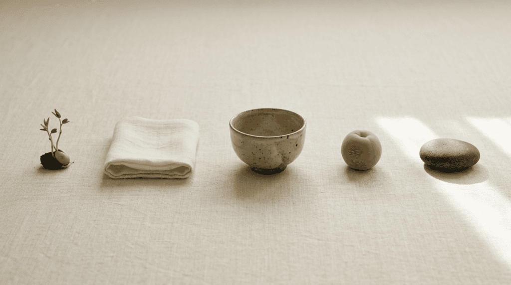
The confusion has a practical cost for anyone borrowing the idea. Strip a room bare and you get austerity, which is a mood rather than a composition. Nothing sits there deliberately, so nothing has room. Yohaku asks the harder question instead. What is this space doing, and what would be lost if something filled it? Answer that honestly and you usually keep more objects than a minimalist would, arranged with far more care. The result feels lived in, yet calm.
One small book draws the same line between Japanese aesthetics and modern minimalism. It does so in barely an hour of reading, with photographs that make each point visible. Its author is a designer, so the advice is always practical.
Wabi-Sabi for Artists, Designers, Poets & Philosophers — Leonard Koren’s classic

Leonard Koren first published this little book in 1994, and the updated edition is still the clearest short account in English. Wabi-Sabi for Artists, Designers, Poets & Philosophers runs to just 96 pages, about half of them photographs. One of its most useful short chapters sets wabi-sabi beside modernism, point by point.
Modernism prefers the clean, the geometric and the permanent. Wabi-sabi, meanwhile, prefers the irregular, the natural and the passing. That comparison maps neatly onto the difference between minimalism and yohaku. Read it with a pencil, and mark the lines that change how you see your own shelves. It pairs well with Tanizaki’s essay.
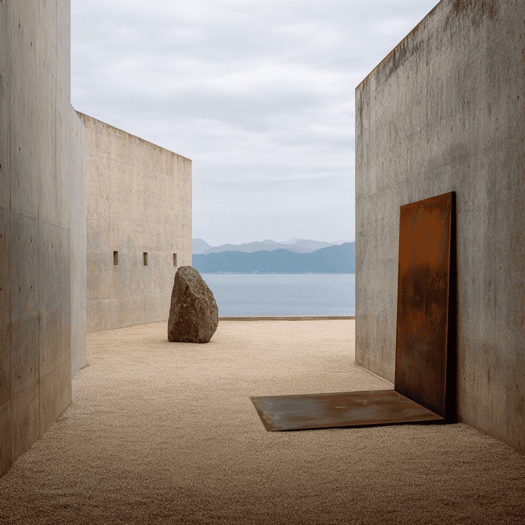
Koren’s distinction becomes vivid on Naoshima. In the Lee Ufan Museum, a single boulder and a single steel plate occupy an open court. Minimalist sculpture could look similar, yet the effect here is different. The stone is rough and old, the steel is weathered, and the sea glints beyond the wall. Every element has a relationship with the empty ground around it. Take one away, and the space loses its tension. The artist designed the court with the architect, so the building and the work belong together.
Add a bench or a sign, and the composition collapses. The emptiness is doing as much work as the objects. Visitors often stand there far longer than they expected, simply looking. The court is small, yet it feels remarkably expansive.
Negative Space in Japanese Art, Brought Home
The principle travels well, provided you apply it rather than copy it. Start with one surface. A shelf that holds a single bowl reads differently from a shelf that holds nine. Nothing about the bowl has changed. What changed is the room around it. The tokonoma is the model, and it scales down easily. One object, one picture, and a margin around both. Rotate the object with the season rather than adding to it. A shallow bowl in summer and a dark vase in winter is enough.
Consequently, the wall stays composed instead of filling up. Store the off-season pieces away, and bring each one out when its moment comes. Japanese homes have done this for centuries, which is why storage matters so much in them.
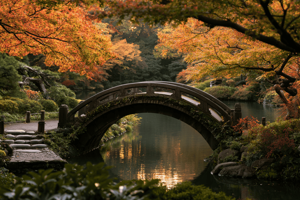
Paper follows the same rule. A page with wide margins reads as calm before you read a word. Indeed, the writing you return to tends to be the writing with room around it. That is not an accident of taste. It is yohaku, applied to a notebook. Then there is the day itself. A schedule is a composition too, and most run edge to edge. Leave one interval empty on purpose and keep it empty for a week. Ten minutes is enough to start.
Our ninety-day ma practice turns exactly that habit into a daily prompt. Small, regular intervals tend to stick better than one long retreat. The pause becomes ordinary, and that is the goal. Many readers start on a Sunday evening.
Recommended
A Skill Anyone Can Learn
Seeing the idea is a skill, and it improves with a few simple habits. A different approach slows the walk down and changes what you notice first. It works in museums, gardens and shops alike. Most of us scan a picture for its subject, name it and move on. The habits below reverse that order. They start with the empty parts, so the subject arrives last and lands with more force. None of them needs training or special equipment. You only need a few minutes and a willingness to stand still.
How to Look at It
Three habits make the difference. Fortunately, none takes long to learn, and a fourth follows on its own.
Start at the Emptiest Part
Find the barest area of the work and stay there. Ask what it is doing rather than what is missing. Because the artist chose that area last, it usually carries the decision. In a scroll, it might be the mist between two mountains. In a garden, it might be the gravel between two stones. Give that area your full attention for a slow count of ten, then let your eye move outward.
Look for the Offset
Japanese composition rarely centers its subject. The asymmetry creates a tension. Meanwhile, the emptiness is what resolves it. A centered version of the same image goes inert.
Notice What You Are Refused
Gardens, screens and scrolls all withhold something. That refusal is the same instinct as the pause in a tea room. It is an interval you are meant to feel rather than solve. A path may turn before you see its end. A screen may cut off a branch at the edge. Rather than feeling cheated, let your imagination finish the view. That small act of completion is the reward the artist intended for you.
Let the Body Rest Where the Eye Rests
There is a physical side to this, and galleries depend on it. When the eye settles on empty ground, the body tends to follow. Breathing slows, the shoulders come down, and the room feels larger than it is. Visitors to Ryoan-ji report it unprompted. Readers of the ma journal describe the same thing as a nervous system reset. We make no clinical claim for it. Instead, we note what the arts have assumed for centuries. Gardens were designed for sitting, after all.
Give the eye somewhere empty to land, and the rest of the person lands too. Try it in the next gallery you visit, and notice how long you stay. Most people are surprised.
You may also like


Those habits work anywhere, but they work best once you can name the idea underneath them. Every art in this essay rests on the same Japanese way of thinking about intervals. Painters, gardeners, potters and architects all shape the gaps as carefully as the objects. Naming that shared habit makes the pattern visible, and it also explains why the idea spreads so easily from the gallery into ordinary life. Japanese has a single word for it. It is a short word with a long reach.
The Idea Beneath All of It
Ma binds these arts together. Whether the medium is ink, gravel, flowers or a room, someone worked the interval. Nothing here is emptiness for its own sake. Our fuller account of the Japanese art of the pause traces how far the idea reaches.
Ten Proverbs to Carry With You
A printable folio of ten Japanese proverbs, each set in kanji with its reading and a line on where you will hear it.
That is also why the principle transfers off the page so easily. A day can follow the composition of a scroll, although most days do not. The same argument applied to attention becomes the space between stimulus and response, our companion essay on the pause before you act. In both cases, the empty part gives meaning room to appear. A pause before speaking, like a margin on a page, lets the next thing land with its full weight. Silence, like yohaku, is never wasted.
That habit is the bridge between looking and doing. The arts train the eye first, and practice then trains the hand. The next section turns to the hand, starting with a brush, an ink stone and a single sheet of white paper.
Learning It by Hand
Reading about yohaku only takes you so far. Holding a brush teaches it faster. The paper punishes a crowded hand and rewards a patient one. The first lesson is the margin. Beginners write to the edge of the sheet, because empty paper feels wasted. Teachers push the first character inward until the column has air on every side. Only then does the writing start to look Japanese. Students often repeat the same character for weeks before the spacing feels natural. Patience, rather than talent, is the main requirement.
The second lesson is the gap between characters. Set them too close and the column reads as crowded, however accurate each stroke. So calligraphers learn to compose the white before the black. The eye judges the spacing first and the strokes second.
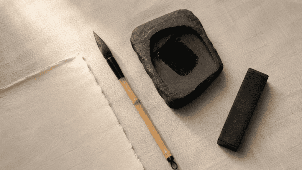
A simple exercise shows the effect. Write one character in the center of a sheet. Then write it again, smaller, with more space around it. Most people prefer the second without being able to say why. That preference is yohaku at work in your own hand. Our calligraphy practice page is open to anyone and needs no signup. If you would rather work on paper, the kanji workbooks take the same characters onto guided practice sheets. Try it with your own name.
For brushwork, the calligraphy workbooks add graded sheets for pressure and rhythm. Real ink, though, needs a few real tools. Most can be found in any Japanese stationery shop, and good sets are sold online too. A starter set is enough.
Bottled or Ground Ink
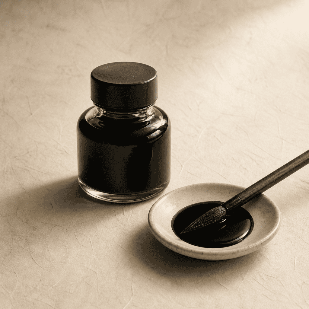
Bottled ink is convenient for a first session, and many students start there. Ground ink, however, changes the whole practice. Rubbing an ink stick against a stone takes a few unhurried minutes, and those minutes settle the hand. The ink also responds to the amount of water, so you can make it pale gray or deep black. That range lets the blank paper and the strokes speak to each other more clearly. Pale ink suits distant hills, while dark ink suits a bold character.
Traditional tools also last for years. A good stick wears down slowly, and a stone can serve a lifetime. Many calligraphers keep the same stone for decades and pass it on to a student. Care for them, and they improve with use.
Kuretake Calligraphy Set — brush, ink stick and stone
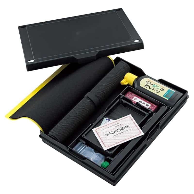
Kuretake has made ink and brushes in Nara for generations, and this Kuretake calligraphy set holds the essentials in one box. It includes brushes, a sumi ink stick and an ink stone. You drop a coin-sized pool of water onto the flat of the stone, then grind the stick in slow circles until the ink darkens.
That small ritual slows the hand before the first stroke, which is half of the lesson. The ink stick comes wrapped in washi and stored in a paulownia box to keep it sound. Practice the margin first, then the gap between two characters. Within a week, the blank paper starts to look like part of the work. Keep the set on a clear table, with nothing else beside it.
Many readers find that a few lines written each evening help the idea settle. Note one interval you noticed in the day: a pause in conversation, a bare wall, a minute on a platform. Write it down without judging it. Over time, the notes become a record of attention rather than a diary of events. The practice takes five minutes, and it trains the same eye that reads a garden or a scroll. Keep the entries short. Over months, patterns appear.
The journal below was made for exactly that, and it takes ma as its single theme across ninety days. Each day has its own prompt and plenty of open space on the page for your notes. It suits a nightstand or a desk.
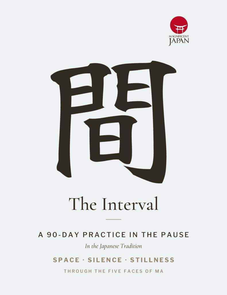
The Interval is a 90-day practice in ma, the pause, built on the same idea as this essay. One short prompt a day explores the gap, the margin, the silence, the breath and the repose. Choose the write-on digital edition for a tablet or the paperback edition for ink and paper. It sits beside The Return, our ikigai journal, in the eight-title Cultural Reflection Collection.
View The CollectionWhat the Empty Ground Is For
Every art discussed here makes the same wager. Leave enough alone and the viewer does part of the work. That binds them to the piece in a way description never manages. That is a generous position rather than an austere one, although it is often mistaken for austerity. Negative space in Japanese art trusts the person looking. Therefore, it hands them something to complete. The finished work, in a sense, exists only when someone looks at it. That shared effort is why the best Japanese art feels so personal to each viewer.
Once you have seen it in a garden, you begin seeing it elsewhere. A room, a conversation, an afternoon. The composition was always available. The vocabulary is what makes it visible. Below, several essays explore it further. Each takes a different angle.
Each of those essays follows one thread of the same idea into a different part of Japanese life. Some stay with art, from calligraphy to the galleries of Naoshima. Others turn to daily habits, such as the pause before a reply or the rhythm of a tea gathering. Read together, they show how a single word, ma, shapes painting, building, speech and time. The more of them you read, the more often you will notice the intervals around you. Start with whichever thread interests you most.
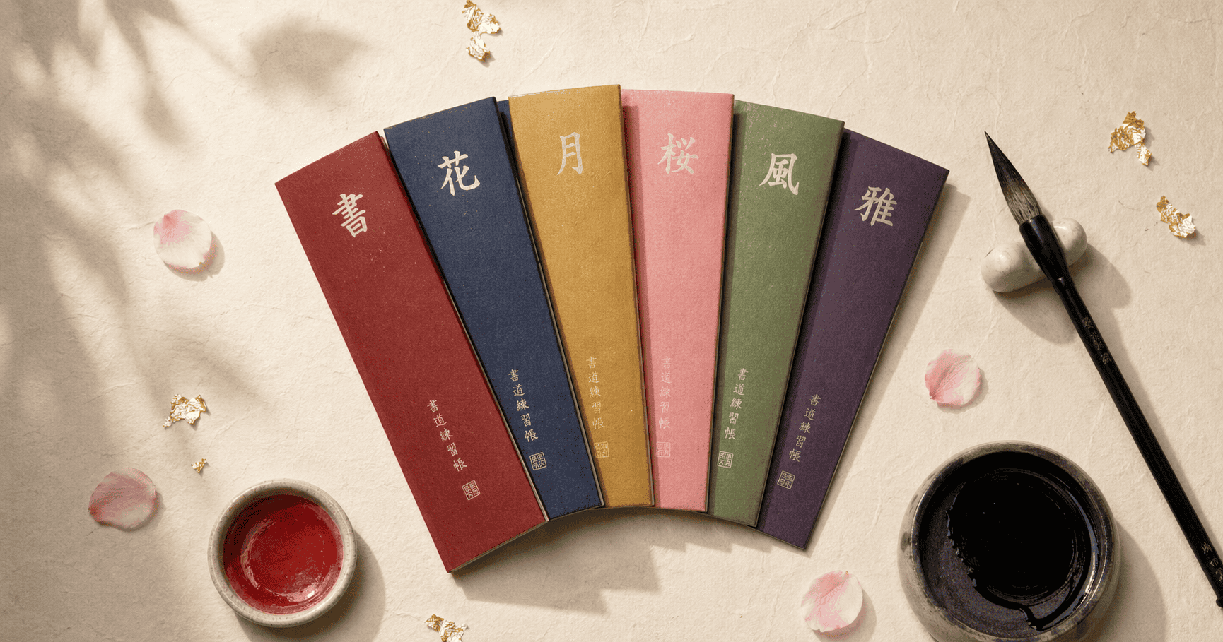
Practice helps yohaku settle into the hand as well as the eye. The tools and journals below were made for that slower kind of learning. Each one turns a few calm minutes into practice. All of them come from Magnificent Japan.
Seeing It in Japan
Of course, the best place to meet this idea is in Japan itself. A morning at Ryoan-ji before the groups arrive, an afternoon in an Ando courtyard on Naoshima and an evening in a tea room in Kyoto can teach more than any book. Our travel designers plan routes like that around gallery hours and garden openings, with time left empty on purpose. Days are planned around one or two places rather than five, so there is room to sit and look. That pace is the whole point of the trip.
They also arrange private tea and calligraphy sessions, so each lesson in this essay becomes something you can feel firsthand. Hotels are chosen for their gardens and their light, as well as their comfort. Every itinerary is built around your own pace.
For the traveler who wants to see negative space in Japanese art up close: a custom itinerary through Kyoto’s dry gardens, a private tea ceremony and the Ando buildings of Naoshima, with mornings timed before the crowds and afternoons left open on purpose.
Plan Your Custom Japan ItineraryQuestions Worth Asking
What is negative space in Japanese art called?
Painters call it yohaku, meaning the remaining white. The wider idea behind it is ma, the interval that carries meaning. Yohaku names the blank area on a specific work, while ma names the principle that governs intervals across every Japanese art form.
Is negative space in Japanese art the same as minimalism?
No. Minimalism reduces the number of elements. Negative space in Japanese art composes the emptiness around whatever remains, so it appears even in dense, richly decorated work. A gold-ground screen crowded with pines still uses it.
What is yohaku no bi?
Yohaku no bi translates as the beauty of the remaining white. It describes the value placed on the unpainted area of a work. That area counts as an active part of the composition rather than unfinished ground.
Why do Japanese gardens use so much gravel?
In a karesansui, or dry garden, the raked gravel is most of the composition rather than the background. The raking gives it rhythm and direction, and the stones are placed to be read against it.
How does negative space work in Japanese architecture?
Traditional rooms are measured in ken, a unit that describes an interval, so a room is defined by the spaces it holds. Sliding screens make that literal, because a wall can become an opening and then a wall again.
Can you practice this outside of art?
Yes. The same principle applies to how a day is arranged, which is what the Japanese idea of ma describes. Composing the intervals rather than filling them is a habit, and habits respond to deliberate repetition.
Why does looking at empty space feel calming?
When the eye has nowhere urgent to go, the body tends to settle with it. Breathing slows and the shoulders drop. Readers often call that a reset. It is a felt experience rather than a clinical claim.
The Editors, Magnificent Japan